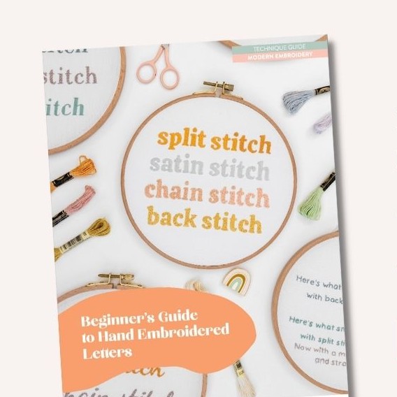
Beginner’s Guide to Hand Embroidered Letters
Introduction
One of the best parts about embroidery, is the ability to personalise your stitching with words.
Adding names, initials or messages can turn your work into something that is even more special and meaningful. Especially if you are giving it as a gift!
Stitching words is something I think you can start relatively early in your embroidery journey, once you have reached the Confident Maker stage. But you might be wondering, where do I start? So, I’ve created this guide to help you with this really cool part of your embroidery journey.
This guide will cover my top tips for stitching letters, lots of info about stitch techniques and fonts, plus a library of font recommendations and stitched examples.
My goal is for you to become confident at stitching letters, get awesome results, and most importantly, enjoy the process!
Let’s get started...
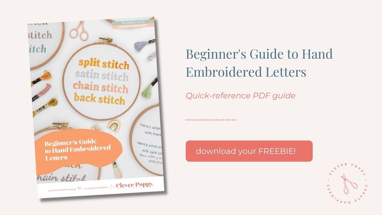
Download the PDF: Beginner’s Guide to Hand Embroidered Letters
Before we go any further, I want to let you know that I've also collated all of these tips and learnings into a PDF download. Which makes it super easy for you to save and refer to my tips whenever you need to.
You can keep scrolling to read this blog, or jump straight to my pdf guide.
Just head here to grab your free copy!
Background
Stitching letters is an area of embroidery where there is so much to learn, and so many opportunities to improve your skills! This is because stitching letters encompass many different factors such as stitch techniques, pattern design and planning.
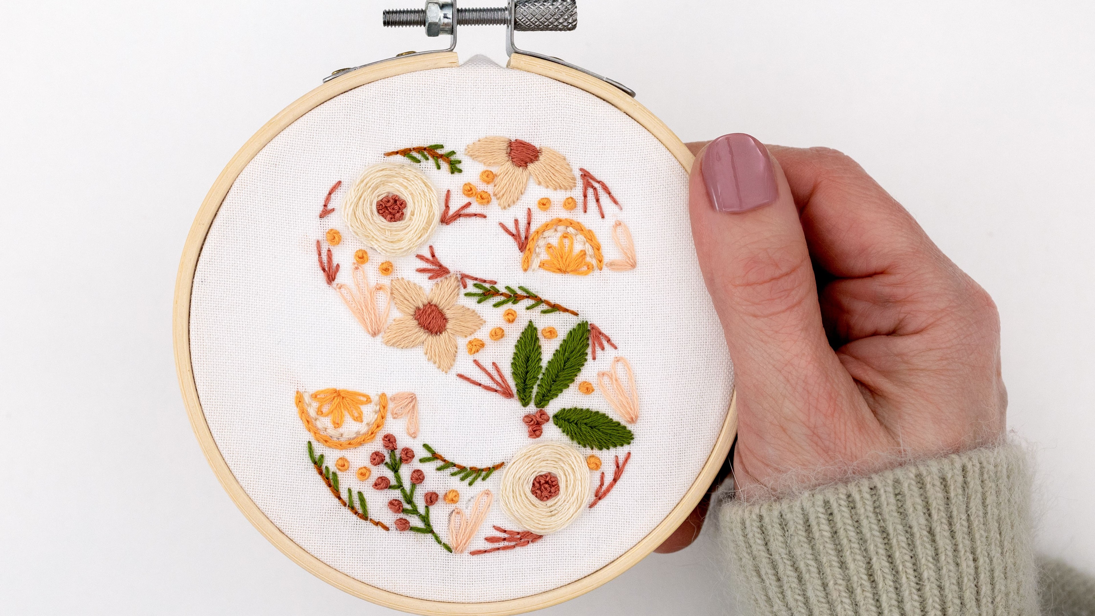
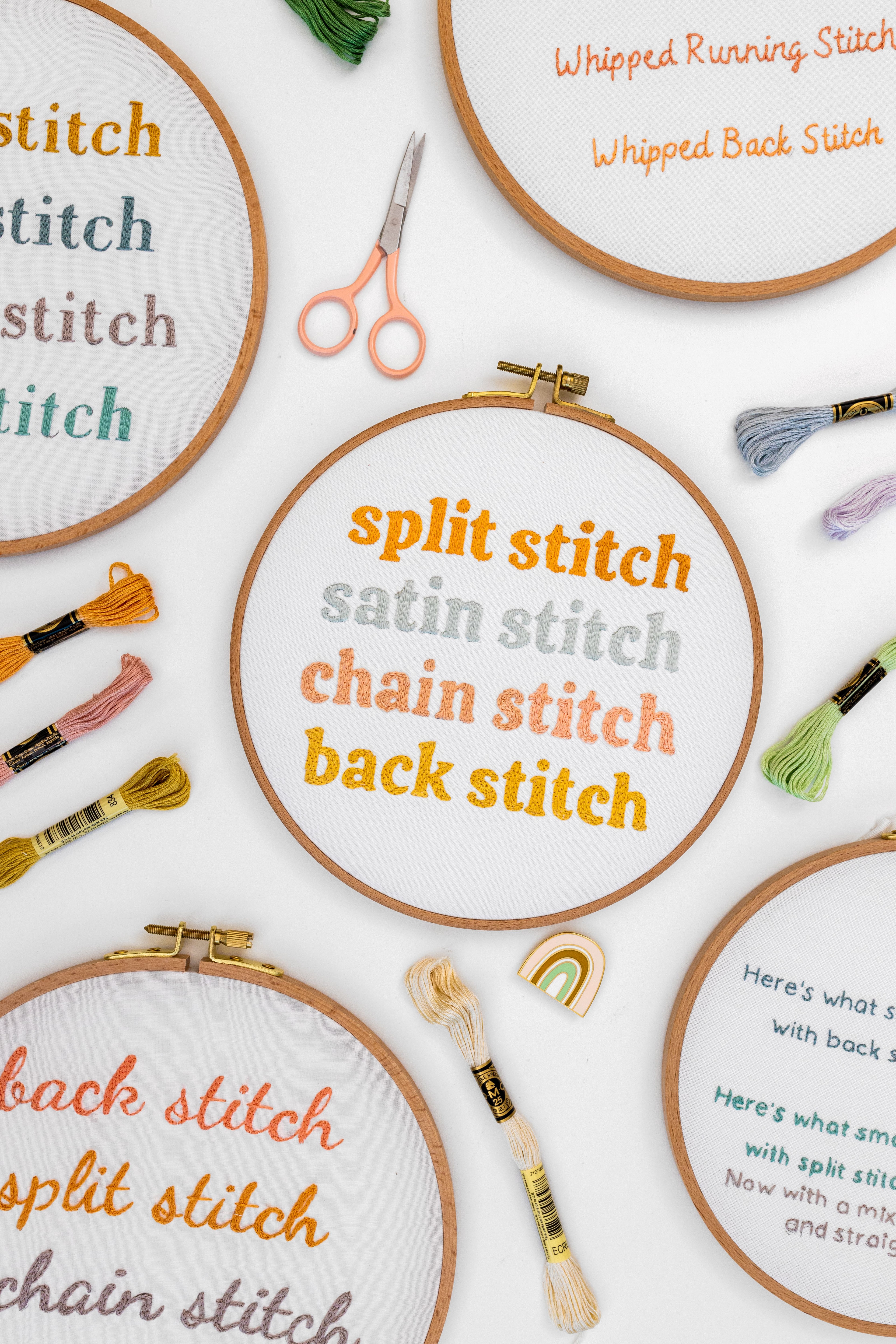
There are lots of different ways you can stitch letters.For example, you can stitch words that look like writing or type written text. Another option is to use a variety of embroidery stitches to form the shape of the letter. Yet another way is to create letters using white space. You can see some examples below.
Five Top Tips for Stitching Letters
First let’s look at my top tips for stitching letters. These apply whether you are stitching from a specific pattern or stitching your own design:
Tip one:
KEEP IT SHORT ON CURVES: As you stitch around the curvy parts of each letter, you’ll find that smaller stitches are easier to work with and create a better result. This is because you’re able to follow the path of a curved line more accurately with small stitches – in contrast, large stitches will jump across the curve creating a more angular effect. So as a rule of thumb, the sharper the curve, the smaller the stitches need to be. In terms of really sharp corners, you can either use super short stitches, or treat it as two lines (e.g. finish at the pointy end of the curve, and then start a new line of stitches for the next part).

Tip two:
WORK A SINGLE-LANE STITCH PATH: When you stitch each letter, you don’t necessarily want to stitch along the same path you would if you were writing the letter by hand. Instead, you want to follow one single-lane path, that works its way over the entire shape of the letter. This is because when we hand write letters, our stroke path often double ups and goes back over itself – which is fine with handwriting, but not so great if it means your actual stitches are doubling up over the same path! So when you stitch a letter, first work out a single-lane path for your stitching (that doesn’t double up) and follow that.
Let’s look at a couple of examples.

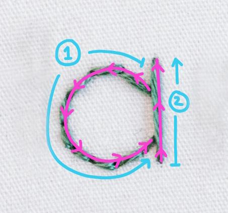
The first letter ‘a’ here shows the path which would be handwritten – note how it doubles over itself on the vertical stroke. But with the second example, there are 2 stitch paths that don’t overlap.
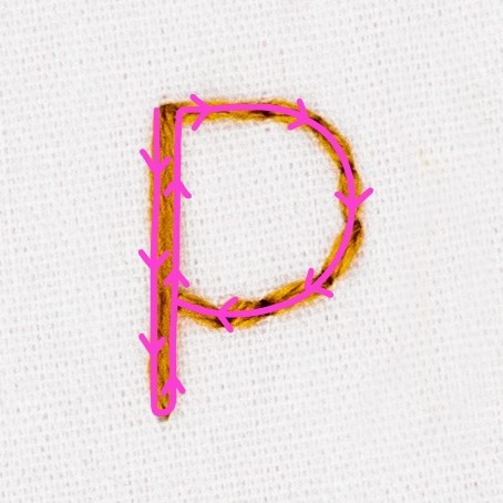
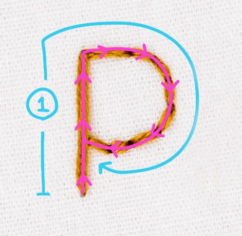
The first letter ‘p’ here shows the path which would be handwritten – note how it doubles over itself on the vertical stroke. But with the second example, there is 1 stitch path that doesn’t overlap.
Tip three:
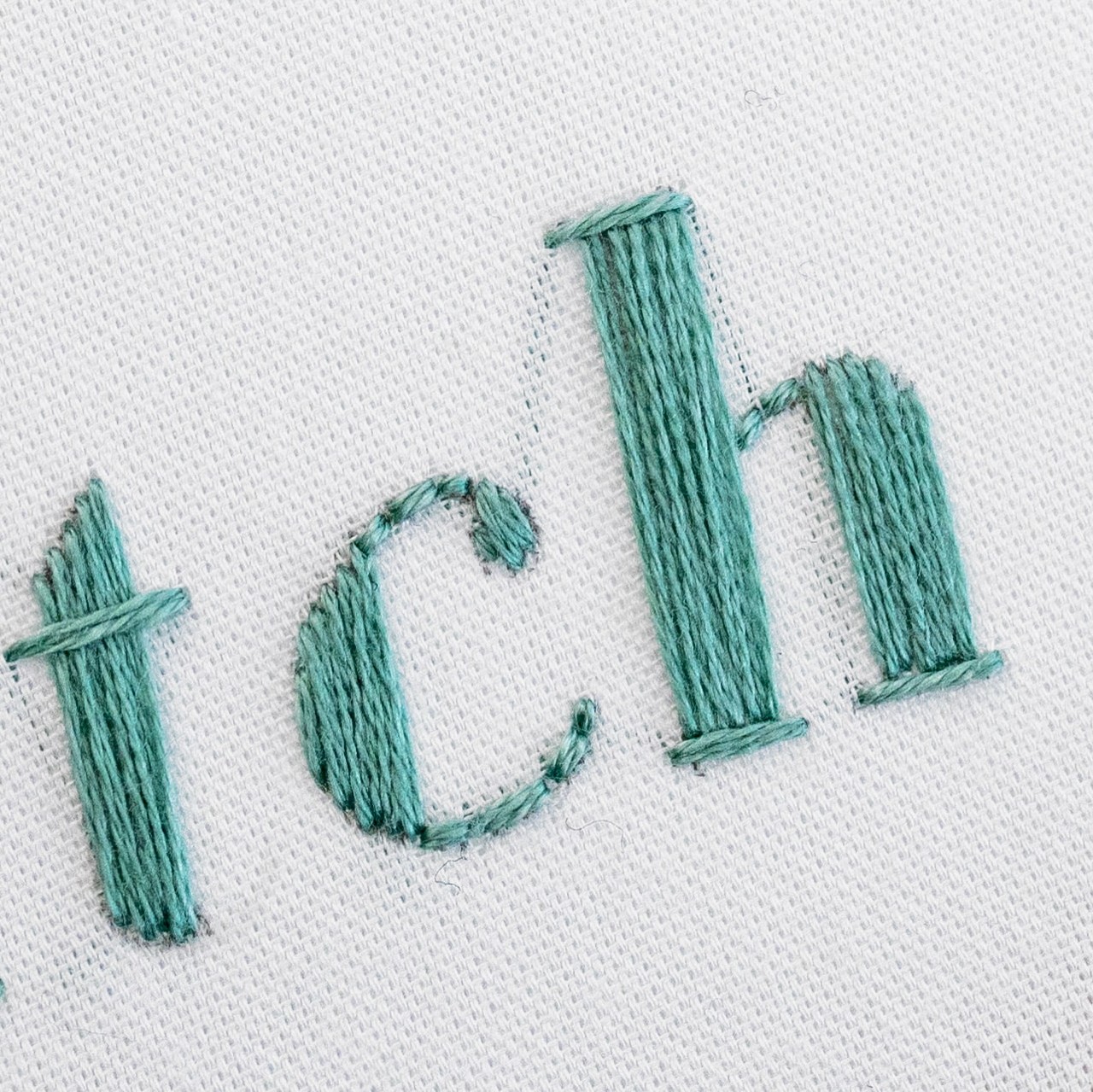
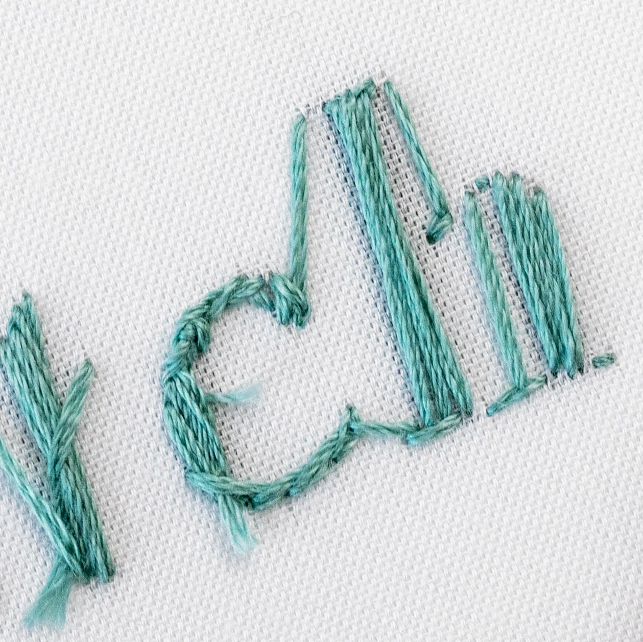
PREVENT THREAD SHADOWS: As you stitch, try not to trail the thread between open spaces within your design, on the underside of your fabric. This means you won’t be left with lines of thread which are visible through to the front, causing what I call ‘thread shadows’. So as a rule of thumb, end your thread when you finish stitching each letter, then start afresh on the next letter. As you will see in this example, there is a shadow where the thread was trailed between the letter c and h.
Here are the exceptions:
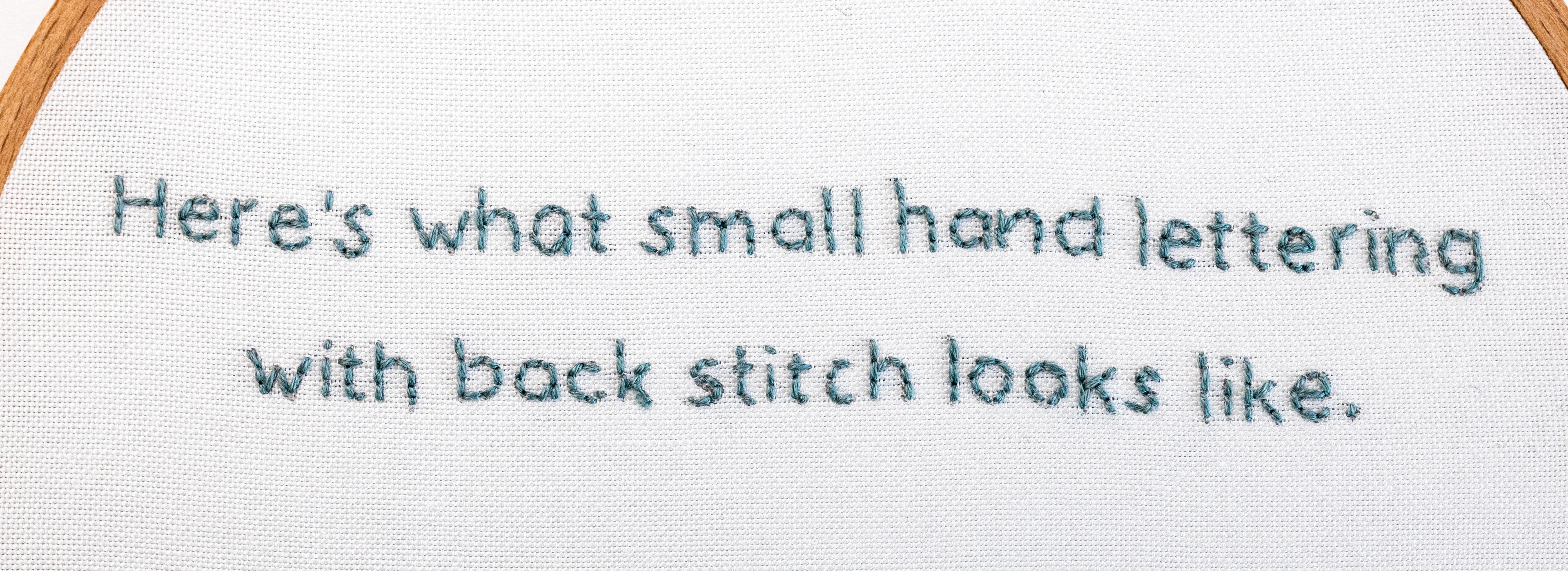
1. When you are stitching small letters which sit right beside each other, you can trail your thread between each letter, because any thread shadows are unlikely to be that visible. And it would be quite fiddly to restart your thread for each letter. As you can see in this example, the thread was only restarted between words (not between letters) and it looks great on the front.

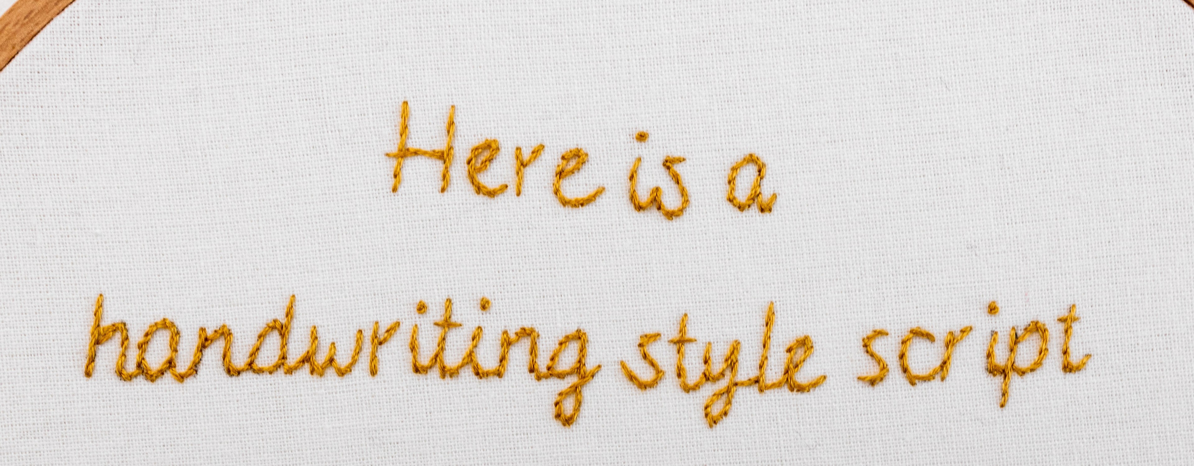
2. When you are stitching script fonts, where the letters actually join up as part of the design. In this example, you can see that the thread trails on the back from one letter to the next, as per the design.
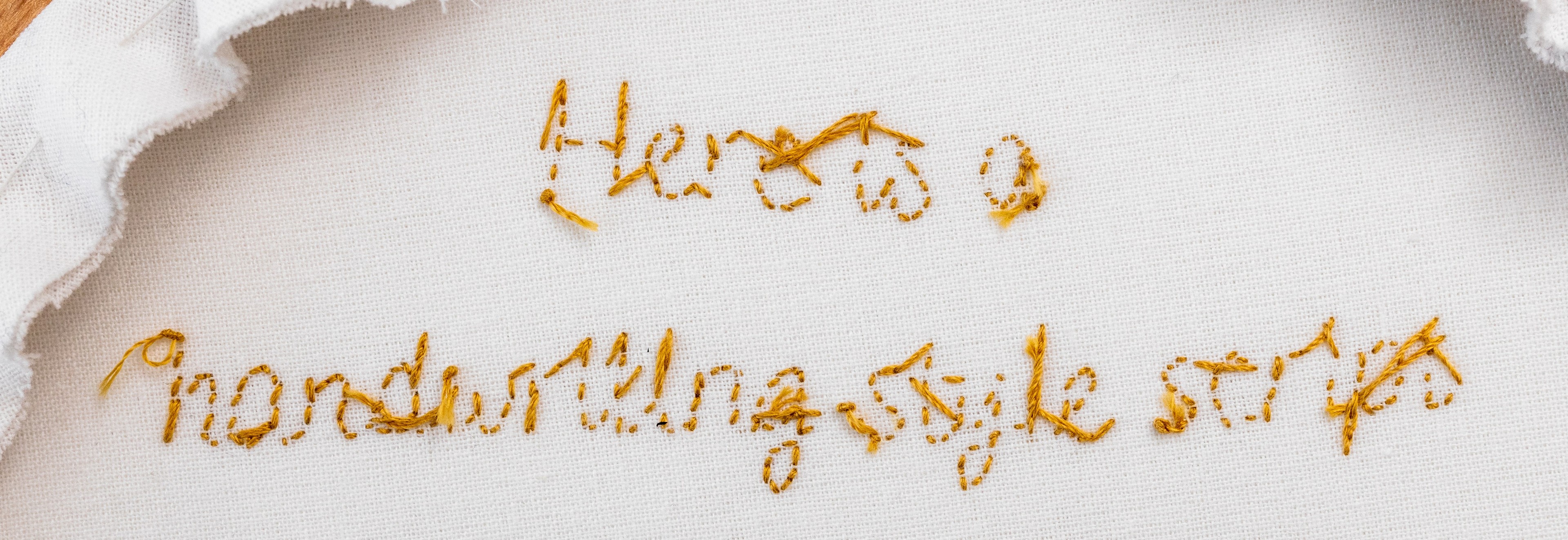
What if the stitching path within a letter needs to jump from A to B? Some letters have a single-lane stitch path that needs to jump from one part of the letter to the next, in order to get to the next part which needs stitching (e.g. ‘b’, ‘d’, ‘m’ or ‘r’). In this case, you might create thread shadows as you move from point A to B. It may not matter, but you do have a couple of options to prevent thread shadows:
-
You can stop and start a new thread where needed. Or;
-
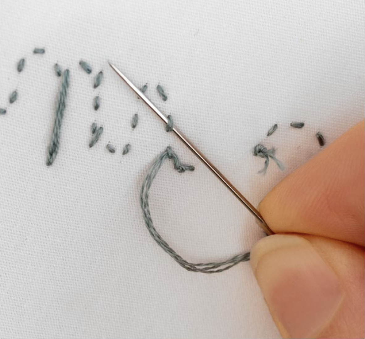
You can weave your thread on the underside of your stitching, to get to the point where you want to start stitching again. This way, your thread trail will be hidden amongst the stitches you’ve already completed. Clever!
Tip four:
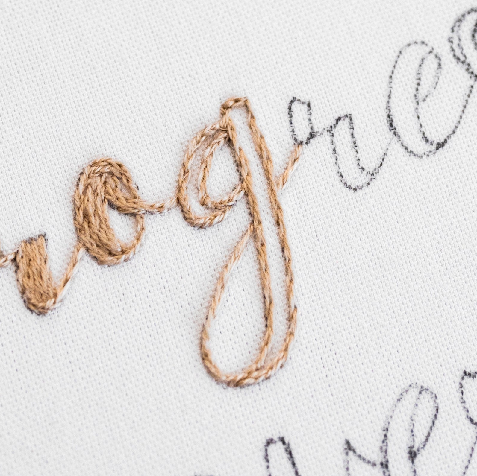
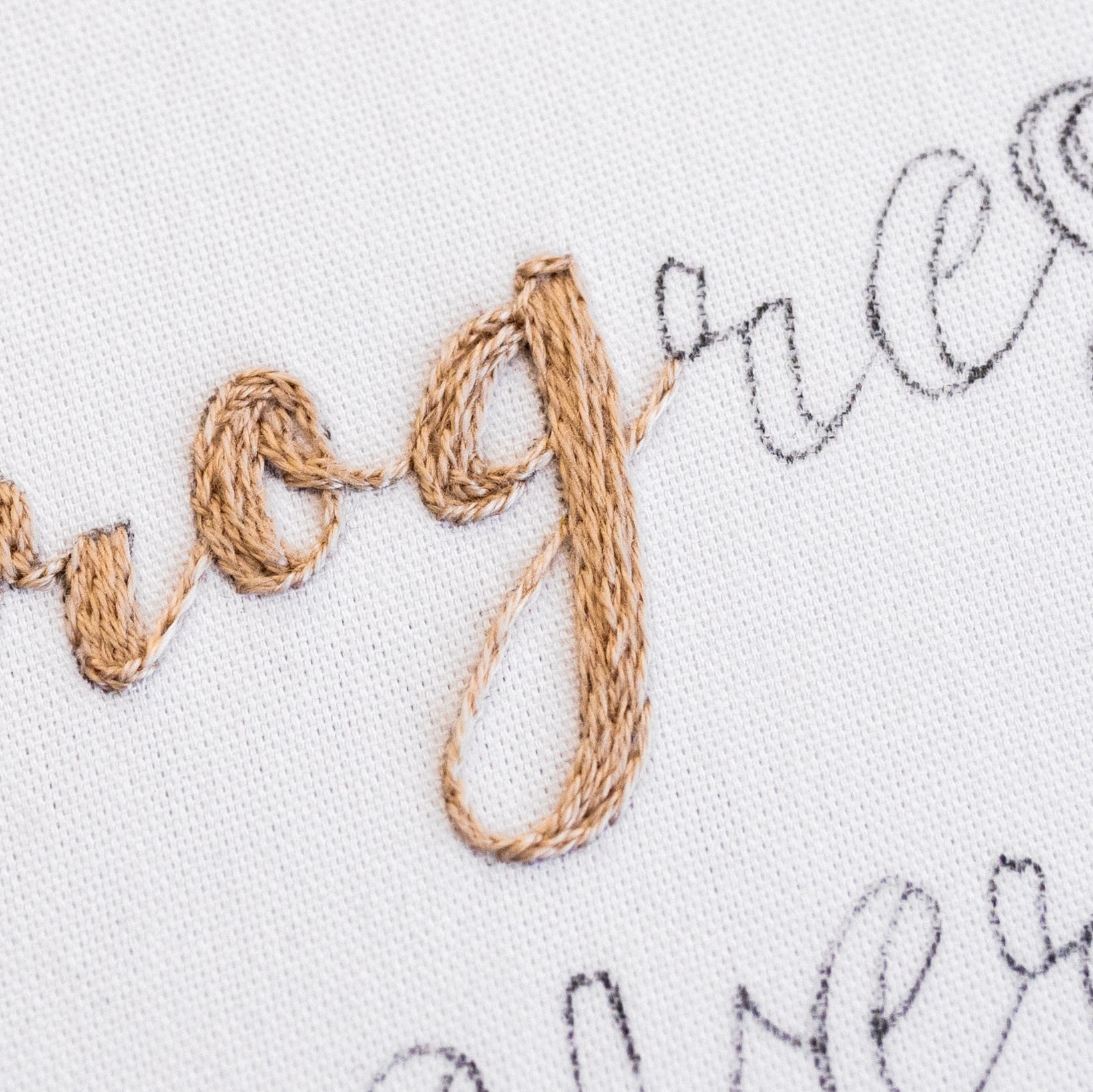
STITCH OUTLINES FIRST: Some letters have a design style which is comprised of both thin and thick parts. In this case, it helps to stitch the outline first, working your way around the border of all the thick parts too. Then work a filler stitch in the areas which need filling. This helps to create a cleaner shape overall, which is especially helpful for lettering.
Tip five:
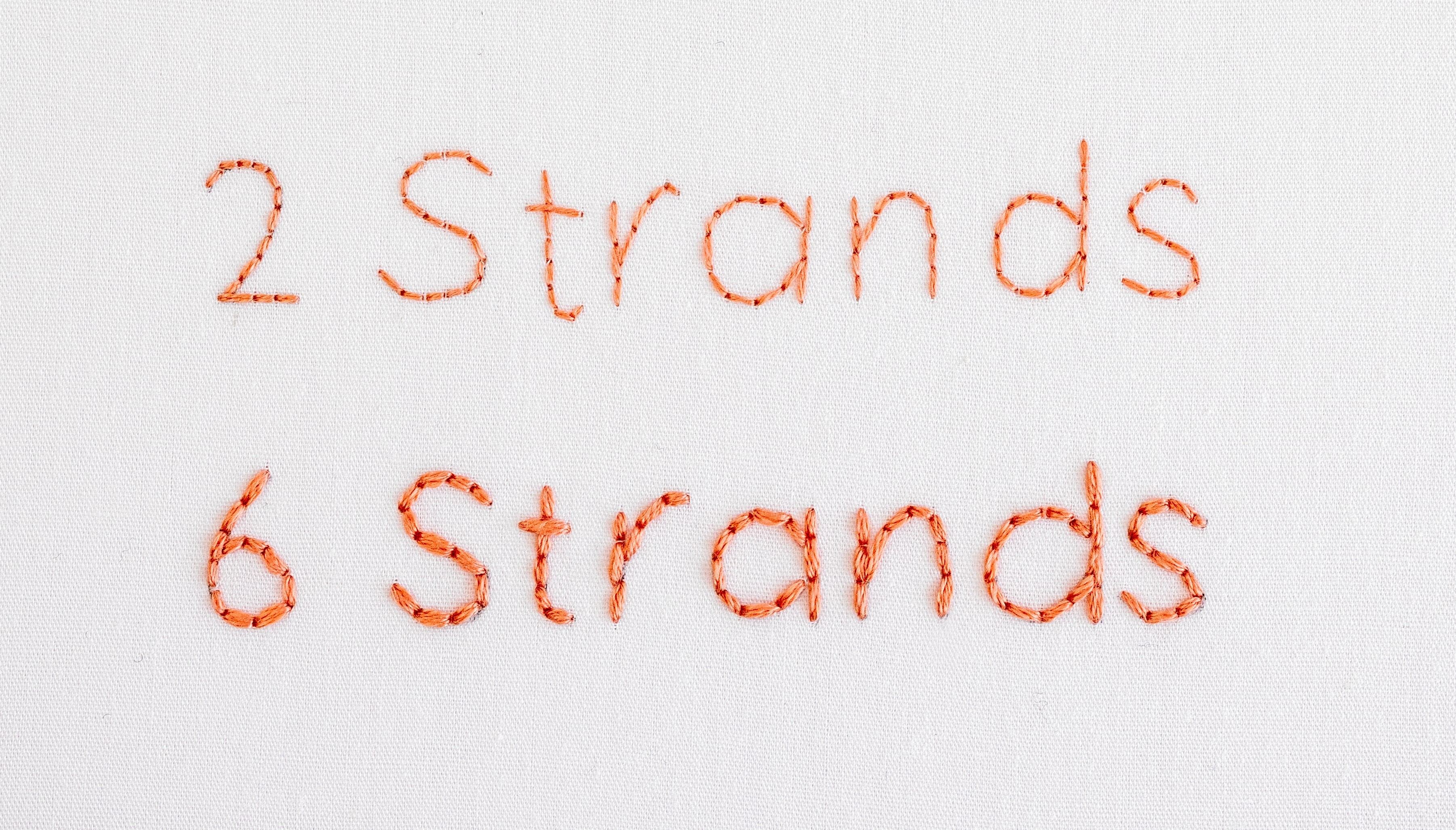
CHOOSE HOW MANY STRANDS OF FLOSS: The number of strands of embroidery floss that you use, will greatly affect the look of your stitched letters (especially if you are working on small letters). You can definitely have a play with this, and choose an amount that suits the look you’re going for. But as a rule of thumb, use 3-6 strands for chunky style and large letters, and 1-2 strands for finer or small letters. In this image, you can see how the words look quite different with 2 or 6 strands of floss.
Let’s talk about Stitch Techniques
Now let’s look at some of the most common techniques used for stitching letters, and my experience of the pros and cons.
First, the ‘Outline Stitches’ – these are techniques which are primarily used for stitching lines (note that some can also be used as filler stitches):
1. Back Stitch
This is one of the easiest options for stitching letters, because it’s quite a simple technique and it’s quick to work with. It’s great for stitching lines and curves, and works well on small and medium sized letters, as well as larger ones. You can also use Back Stitch to fill thicker sections of letters – using a brick effect looks fab!
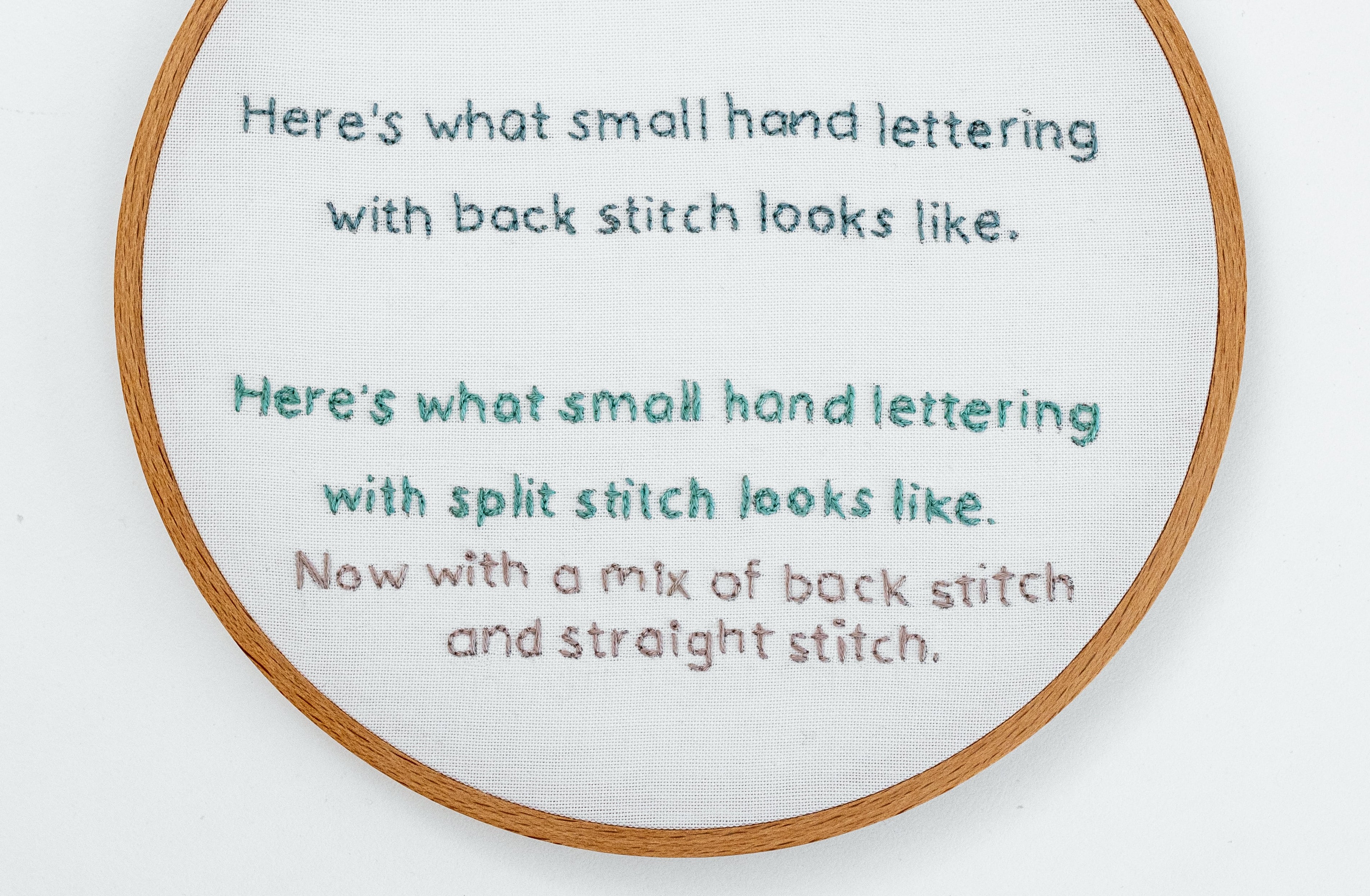
Plus you can use it as an outline stitch on letters filled with another stitch technique (e.g. Satin Stitch). The downside of Back Stitch is that it doesn’t really create a smooth line – instead it creates a slightly bumpy effect, because each stitch is distinct from the next. But this actually looks quite cool, and might be just the effect you are looking for! In the two examples here, you can see Back Stitch worked as a small outline stitch, and as a filler stitch on chunky display letters.


2. Split Stitch
This technique creates a nice, evenly textured line, because each stitch is blended into the next (unlikeBack Stitch, where each stitch is distinct from the next). This makes it great for small and medium sized letter, plus the larger sized ones. Split Stitch is also good for corners, because you can create a smooth effect around bends in the shape of your letters. It can also be used for filling in thicker sections of letters, with an evenly textured effect. In the two examples here, you can see Split Stitch worked as a small outline stitch, and as a filler plus outline stitch on medium sized letters.

TIP: For quite curvy parts of a letter, I find it easier to work my Split Stitch in the Back Stitch method. This is just like Back Stitch, but you split the previous stitch as you go. I find it easier to accurately follow the curves with this method, compared to normal Split Stitch – but both work well.
3. Chain Stitch
This technique creates a lovely textured line, because each stitch is uniformly linked with the next. Chain Stitch definitely creates a line which is a bit bulkier than other outline stitches, but it feels quite cosy and reminds me of knitting. This means that it’s great for medium and large sized letters, as well as for filling thicker sections of letters. I wouldn’t recommend it on small letters, because it’s hard to create a fine line with this technique. Chain Stitch can be tricky to workaround corners, but it’s doable if you’re up for the challenge! In the two examples here, you can see ChainStitch worked as a filler (teamed up with Straight Stitch on the serifs in the second example).


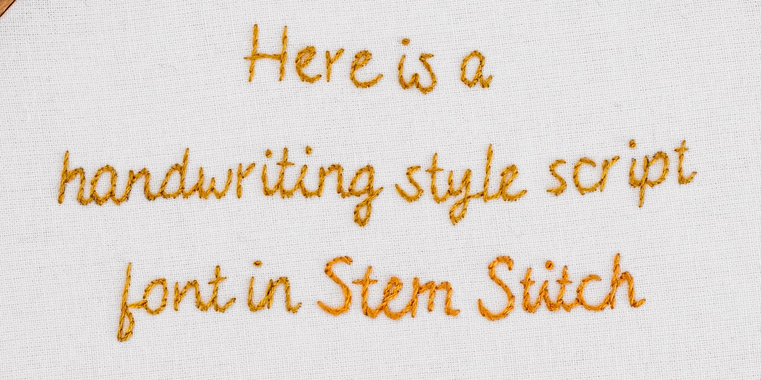
4. Stem Stitch
This is quite an elegant option, which creates a beautiful smooth and rope-like effect. Stem Stitch is also great for navigating around corners and works well on medium to large sized letter (I wouldn’t recommend
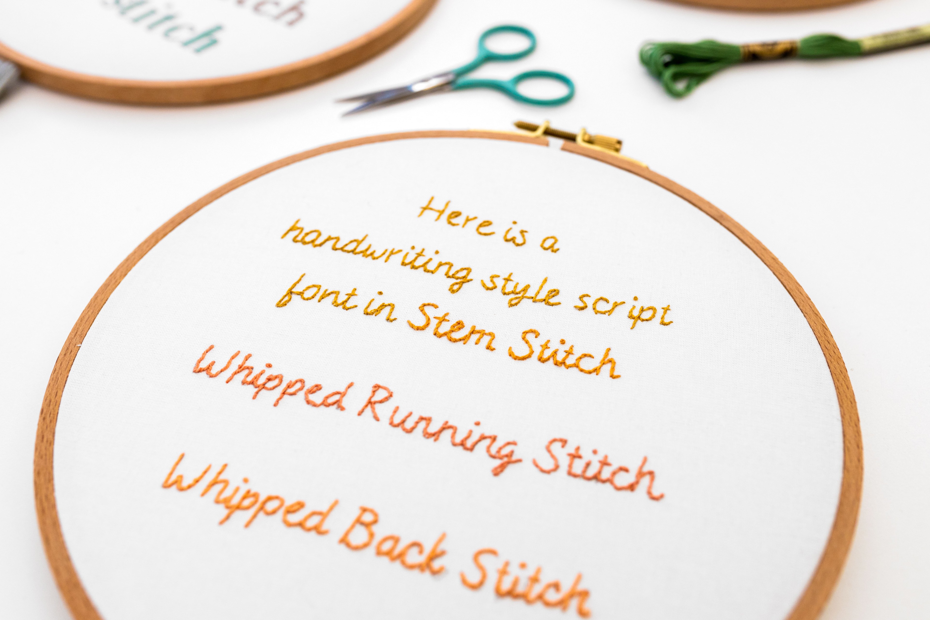
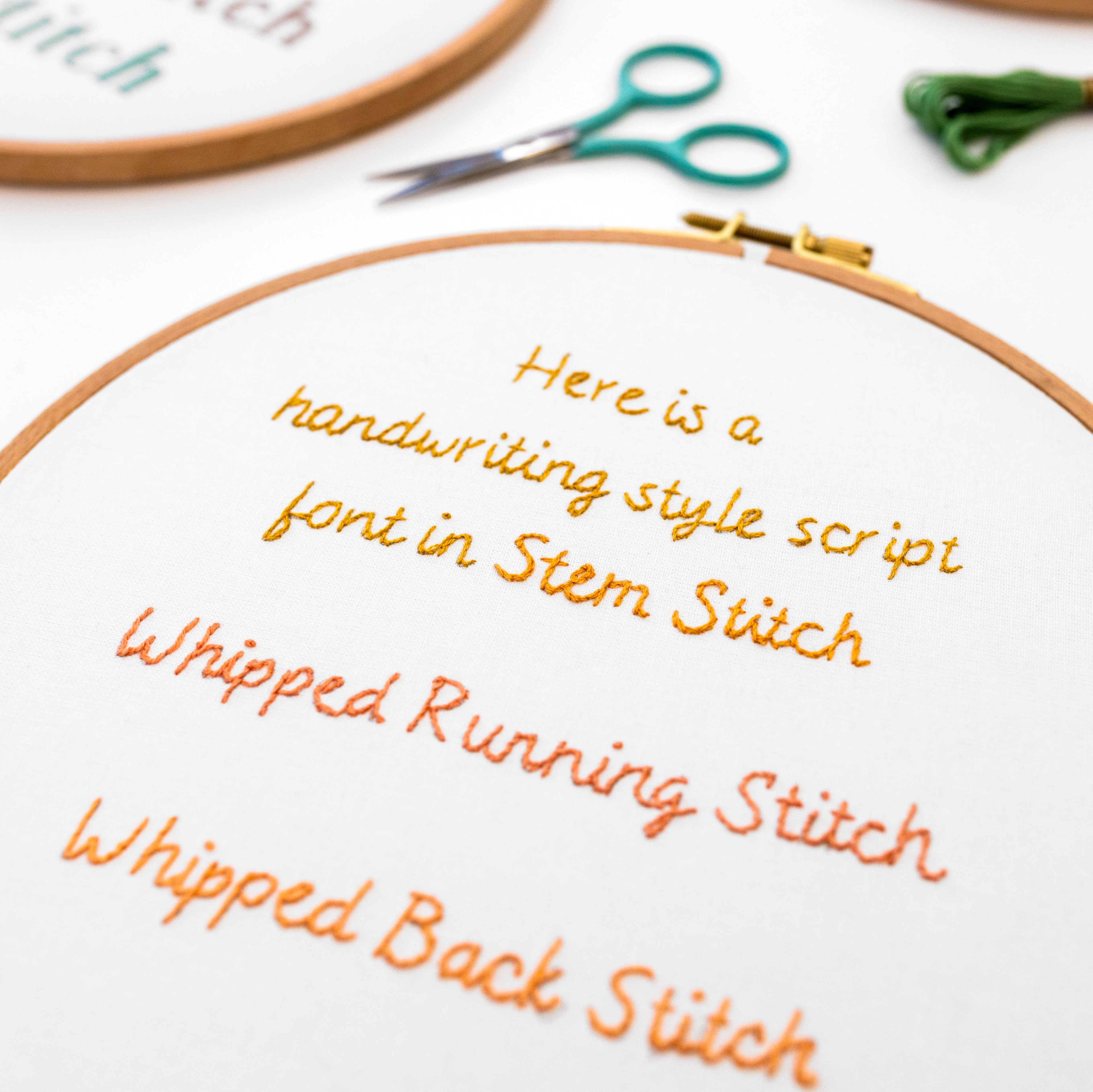
it on small letters). It’s a really popular technique for stitching script or handwriting style fonts (where the letters are joined) because the effect is so smooth and flowing. Stem Stitch can also be used for filling in thicker sections of letters, with a ropey effect.However, you may find this technique quite challenging to work with, and it takes practice to get the lovely rope-like effect (as opposed to a more jagged look). But the beautiful result is often worth the effort! In the two examples here, you can see Split Stitch worked as an outline stitch on a handwriting style script font, and as a filler plus outline stitch on medium sized letters.

TIP: Make sure you keep your working thread on the same side as you stitch along, and always work left to right (or vice versa if you’re left-handed). This means turning your hoop around whenever you need to.
5. Running Stitch
This technique is super simple and fast to build up, and works well for medium and large sized letters. It creates a bit of a staggered effect (rather than a smooth line), because of the gap in between each stitch. So, I wouldn’t recommend it for really small letters, because the gaps might make the letters hard to read.

6. Whipped Running Stitch
This is a beautiful technique to use for a smooth fine line, and is quite easy to work. The double-stage nature of this technique means that it is a bit more laborious than some, but it’s still relatively fast to build up. It is quite a detailed process, so I wouldn’t recommend it on super small letters (the small stitches would be too hard to whip).

7. Whipped Back Stitch
This is another lovely technique for creating a smooth line. It creates a slightly thicker line than Whipped Running Stitch. The double-stage nature of this technique means that it is a bit more laborious than some, but it’s still relatively fast to work with. It is quite a detailed process, so I wouldn’t recommend it on super small letters (the small stitches would be too hard to whip).

8. Straight Stitch
This technique is great for stitching a smooth straight line, and it’s really quick to build up. But it can only be used on letters which are made up of straight lines, without any curves. So this makes it quite restrictive, and it’s usually used in combination with other stitch techniques.
Second, the ‘Filler Stitches’ – these are techniques, which are primarily used for filling in thick letters (or parts of letters):
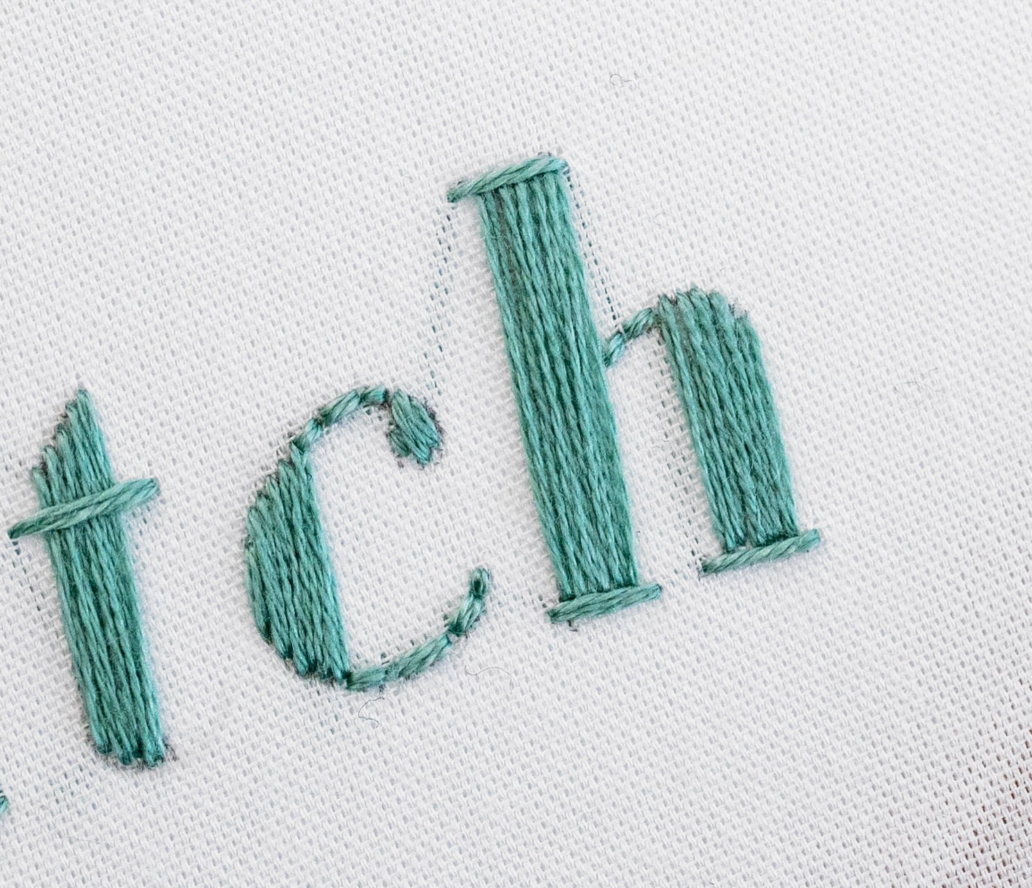
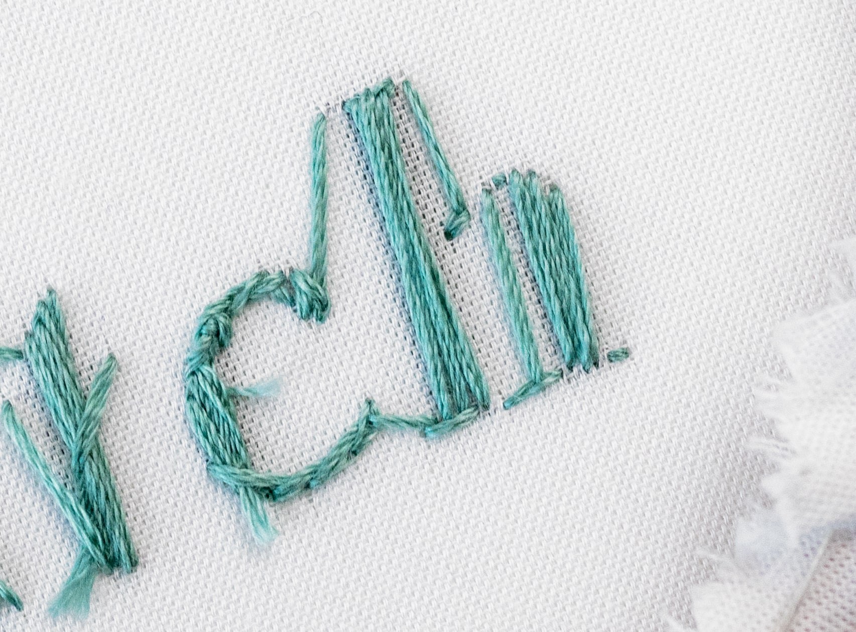
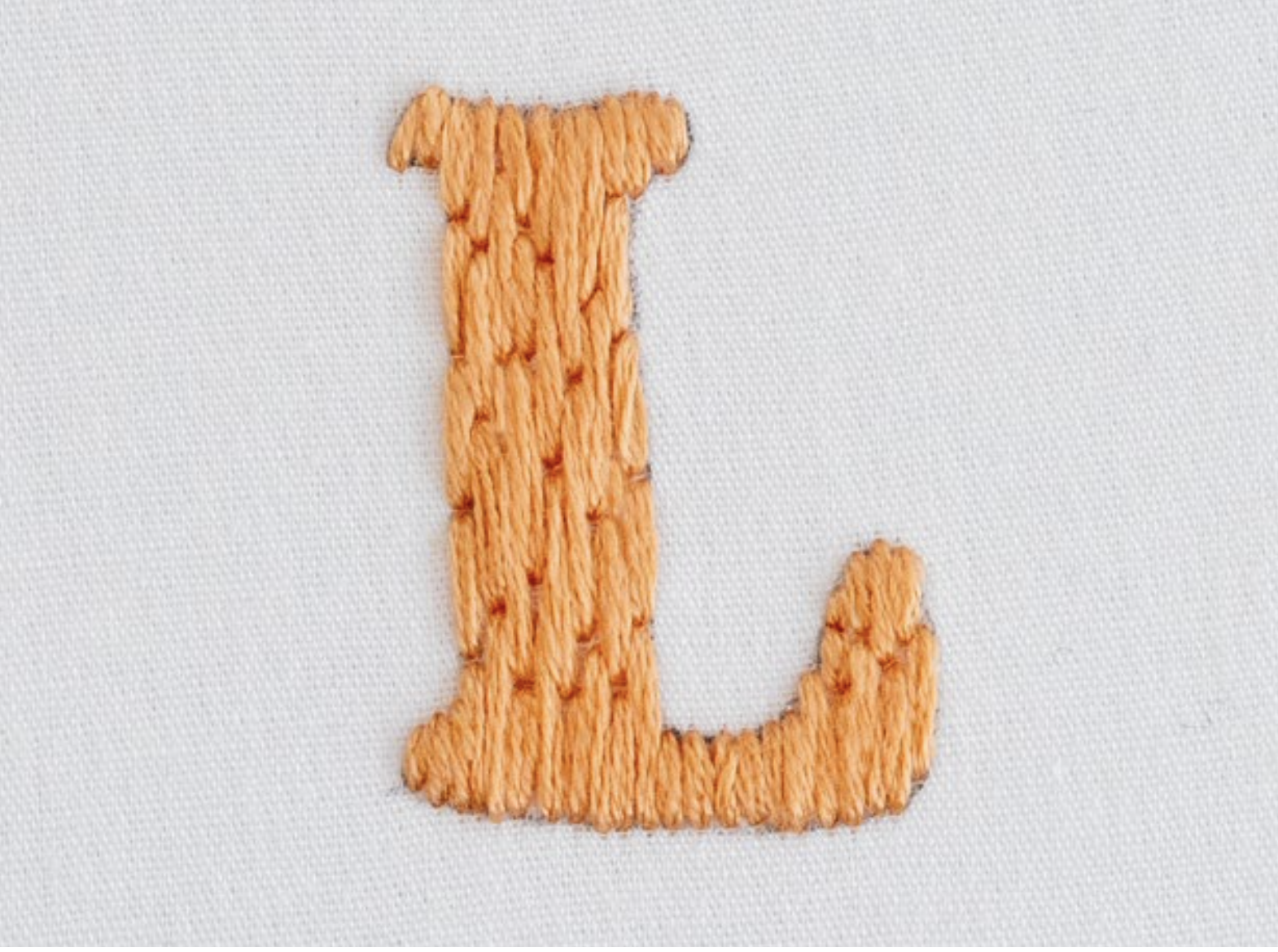
9. Satin Stitch
This is a fantastic option for filling in entire large letters.It’s also great to fill in the thick sections of letters, when teamed up with another font (e.g. Back Stitch) that is worked on the line sections of the letter.
Satin Stitch creates a lovely smooth effect, and it is relatively fast to build up (compared to filling areas with techniques such as Back or Stem Stitch). It can be tricky to create a flawless effect with Satin Stitch, so all of the usual tips for this technique are helpful (e.g. directional lines, stitched outlines, strands of floss etc).
As always, you also need to take care about the length of your SatinStitch – for example, if it’s a really wide area, you maybe better with a different technique such as Long andShort Stitch, to prevent the threads from getting wobbly. In the two examples here, you can see SatinStitch worked as a filler (teamed up with Back Stitch on the thin parts in the second example).
10. Long and Short Stitch
This is a great stitch technique to use as an alternative to Satin Stitch, on large letters (or large sections of letters). This technique can be quite quick to build up, just like Satin Stitch. Once again, you can refer to our general tips for this stitch– e.g. using directional lines can be helpful.
11. French Knots
You can fill thicker areas of letters with French Knots. This is quite a time consuming process, but creates a really cool, textured effect. You can actually use French Knots to work an outline as well, if you are good at placing them accurately.
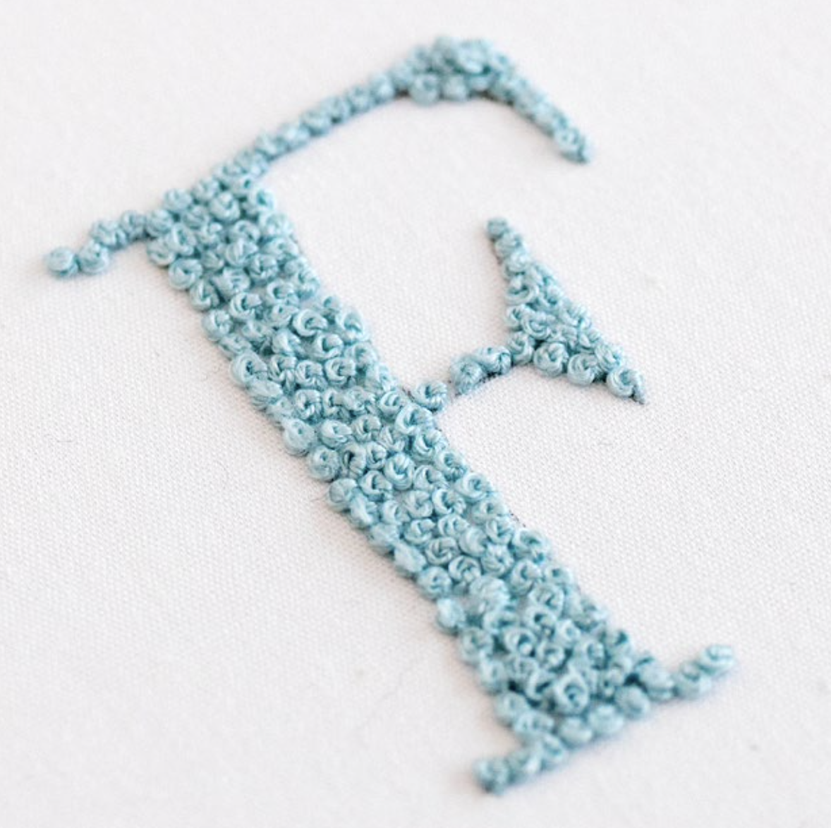
You can fill thicker areas of letters with French Knots. This is quite a time consuming process, but creates a really cool, textured effect. You can actually use French Knots to work an outline as well, if you are good at placing them accurately.
What about a combo of stitch techniques?
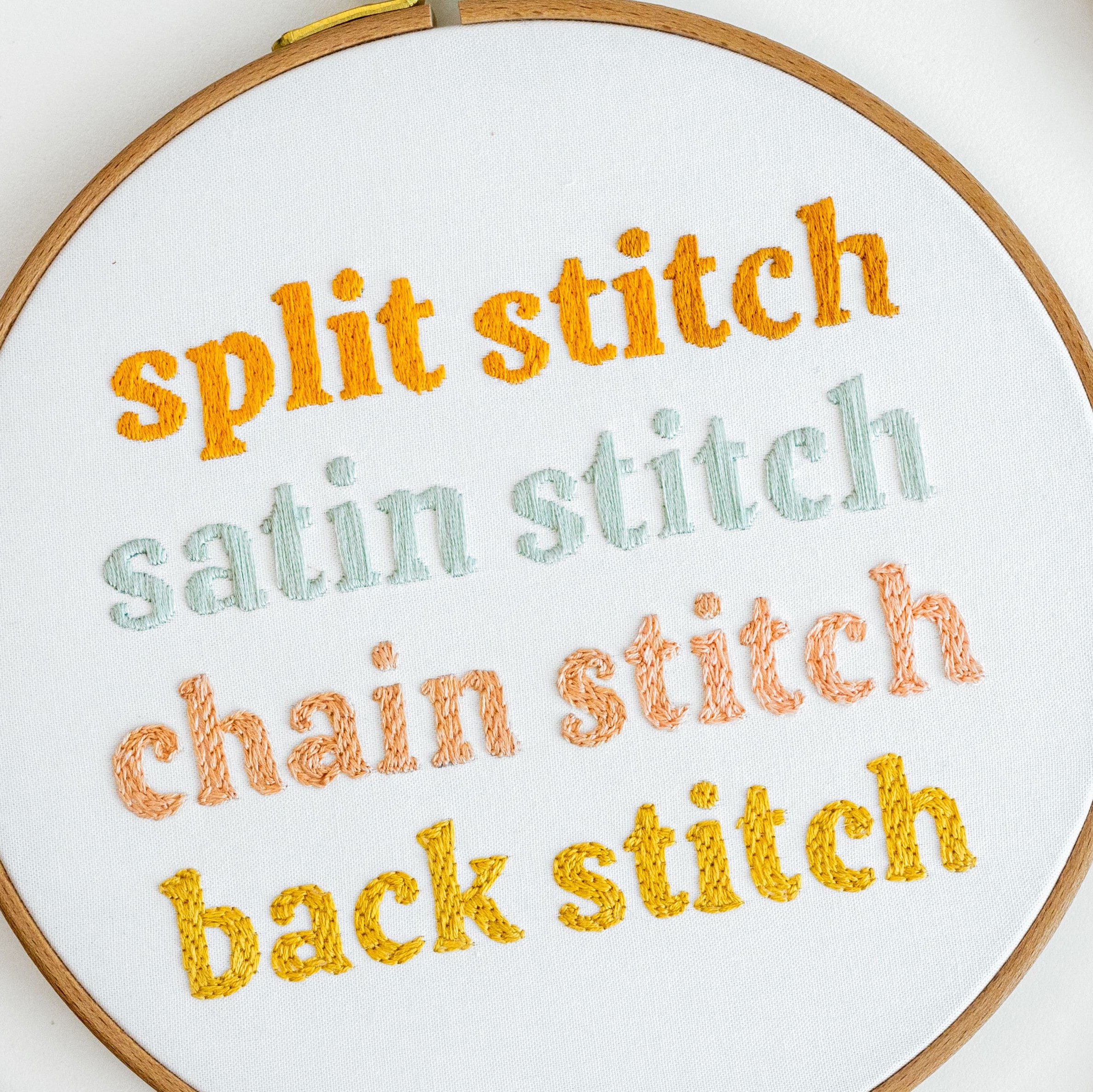
Yes! You can totally use a combination of two or more of these techniques within your letters. For example, you can use a combo of Back Stitch on the curved sections of your letters and Straight Stitch on the rest. Or you could use a combo of Back Stitch for the parts of the letter, which are a line or curve, teamed up with Satin Stitch for the thicker areas which need filling.
How do I choose which Stitch Technique to work with?
One of the most important factors with hand stitched letters, is working with a technique that will not only look great, but be enjoyable to stitch. If you are working off a specific pattern, the artist will most likely give you this information, and you can follow their recommendation – easy peasy!
If you need to choose the technique yourself, then you can use the key factors set out below, plus the information about the specific fonts in the previous section, to help you decide:
1. Weight of the Letters
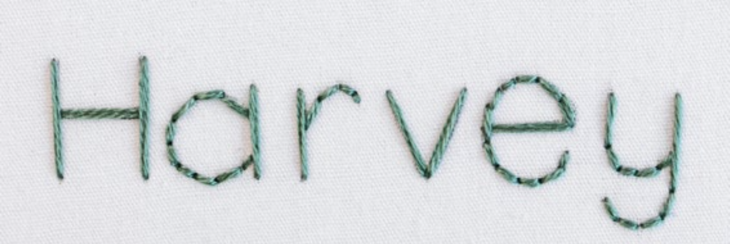
Some stitch techniques are suitable for lines, some are more suitable for filling areas, and some can do both.So, you need to consider whether the letters in your design are made up entirely of lines and curves which all have the same stroke weight? Or are they large shape that will need filling in? Or, do they have varied stroke weights in each letter, which means a combination of lines and thicker areas? For example, ‘outline stitches’(e.g. Back Stitch, Stem Stitch and Split Stitch) work well with script fonts which have a handwritten style with an even weight across all of the strokes – this is because you can stitch a flowing line effect with them. See this example here.


Whereas techniques that can be used as ‘filler stitches’ (e.g. Satin Stitch and Back Stitch) work better with chunky display style fonts, because you can more easily cover ground with them.
2. Style
Each of the stitch techniques can have quite a different look, so the overall style and design of your embroidery piece will influence your choice. Because you want the stitched letters to fit in nicely with the rest of your design.
For example, Chain Stitch creates a lovely cosy knitted effect, so it might suit an embroidery design with a homely vibe. Whereas Stem Stitch creates a beautiful elegant effect, so it might suit a more sophisticated wedding announcement.
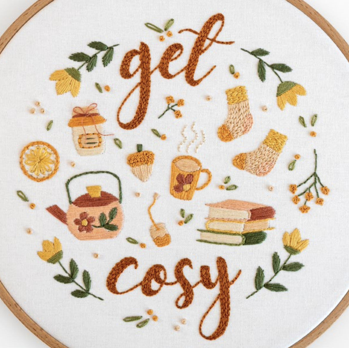
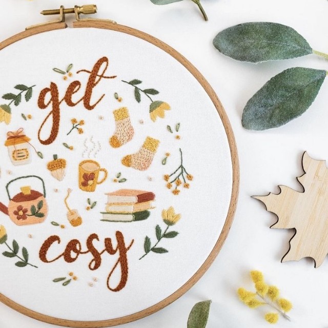
This is an example of Chain Stitch in my 'Get Cosy' style pattern.
3. Time
Some stitch techniques take longer than others to work with – for example, Whipped Back Stitch will take longer to work an outline than Running Stitch. Or SatinStitch will be quicker to fill a space than Stem Stitch. So, depending on how much time you have on your hands, this may affect which stitch technique that you choose.
4. Skill Level
As you will learn in this guide, certain style fonts and stitch techniques will suit Confident Makers who are still relatively new to embroidery, and some will suit Super Confident Makers. And actually, which stitch techniques that you prefer and find come naturally can be quite personal thing! For example, I find Stem Stitch really challenging, but I know that it is the go-to stitch for many embroidery artists. So bear this in mind when you’re choosing which technique to use.
Tips for Designing your own Letters
Now that you have a good understanding of how to stitch Letters, and which stitch techniques to choose, I hope that you are feeling confident to personalise your work with your own letters and words! I have lots of tips to help you with this too:
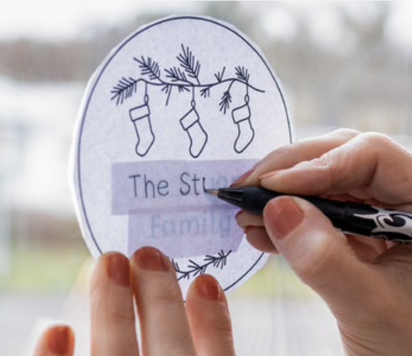
1. Add the Letters First
This might sound so simple, but I really recommend that you draw or trace your words onto your design template first, then you can transfer the whole design onto your fabric, using your usual method. This means that you can have a play with spacing and aligning the letters at this early stage, when it’s all on paper (or on-screen). Rather than trying to get it right first time as you are drawing onto your fabric.
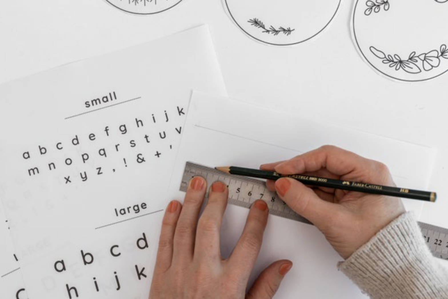
2. Use Guidelines
Whether you are drawing the letters freehand or tracing them, it definitely helps to use guidelines for positioning your letters straight along the line. If you have multiple words, you can do more than one guideline.
3. Try Hand-Drawn Letters
You can totally freehand draw your letters into your design. The outcome will depend greatly on what your handwriting is like – I’m sure some of you can write in beautiful script! But for most of us, the result will be quite obviously hand-drawn (i.e. quite imperfect).
So, this option works well if your design has a light-hearted or casual look. And actually, it looks super cute if you get the kids to write the words!
4. Try using a Font
If you are anything like me, it’s not easy to make your handwriting look nice enough for an embroidery design.But that’s ok, because you can totally use a designed font instead! To do this, you need to use an online program to create your letters in (e.g. Microsoft Word, or Canva). Have a play with the design of your letter sussing different fonts, line weights and sizes. Once you’re happy, you can print off your letters and trace them onto your design template (or you can even trace them directly from your screen).
Let’s Talk More about Fonts
This is quite a complex area of design, so I don’t want to overwhelm you with information. But an overview of what fonts are all about will help you choose the right style for your letters.
What is a font?
Some of you might be wondering what on earth a font is? In a nutshell, it’s collection of characters with a similar design. With your online programme, you can choose which ‘font’ the words are displayed in, and this will affect the style of how they look. For example, some fonts are really easy to read, and are therefore great for smaller sized text, or lots of words. Some fonts are more elaborate and eye-catching – these are more suitable for short sections of text and large letters. And some fonts have a lovely flowing hand-written style(e.g., script fonts).
Which fonts are best?
There are so many amazing fonts which work well for hand embroidered letters. I encourage you to type up your chosen words, then try out different fonts and see which you like. You will find that changing the letter sizes and weights also affects how they look. It’s easy to get lost, so here are some more tips for choosing a font:
1. Letter Size
Consider the size of your letters within the overall design of your pattern. If your letters are large, you can choose display style fonts. But if they are small, you need to make sure they are shown in a really legible font. This is because the smaller the letters are, the trickier it will be to accurately stitch their shape – so simple is best.
2. How many Words?
This ties in with the size of each letter (as above) – if you have a lot of words, you probably want to keep it quite simple and choose a font that is legible. But if you have only a few words (or just one), you can have fun choosing a display style font.
3. What Stitch Technique do you want to use?
If you just want to stitch your words with a line style, then you’ll need to choose a font that has a consistent weight across all of the letter strokes - then you can work it with an ‘outline stitch’ such as Back Stitch. But if you’d like to try filling thick areas in with stitches, you’ll need to choose a chunky style display font – then you can work it with a ‘filler stitch’ such as Satin Stitch.
4. How much time do you have?
If you are short on time, you’ll need to choose a simple font that can be worked with an ‘outline stitch’ and doesn’t have any thicker areas that need filling. If the opposite applies, you can choose a more elaborate display style font that will take longer to stitch.
My Font Recommendations and Stitched Examples
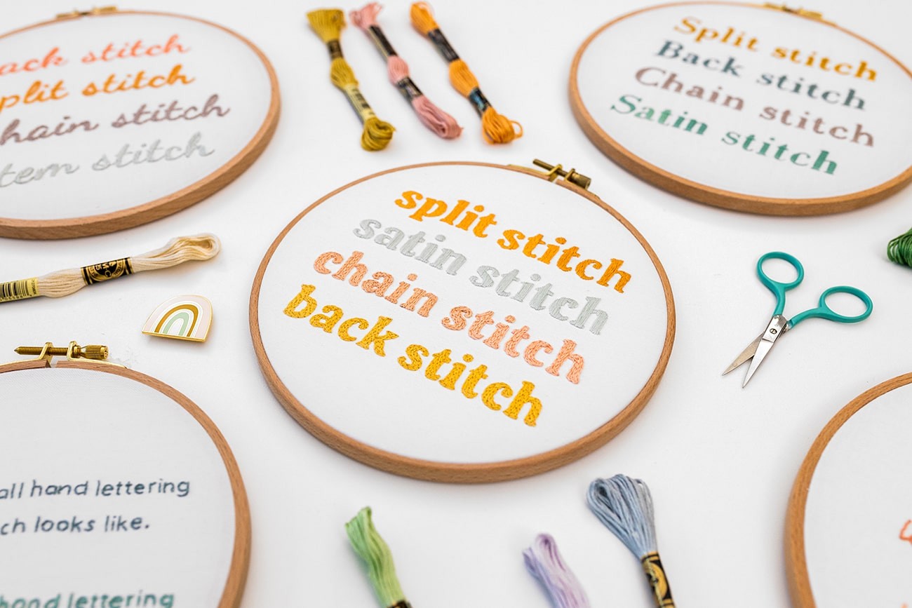
Even with all of this information, it can still be difficult to narrow down which font to use, amongst the hundreds(thousands!) of options available online. And I know how helpful it is to see real-life examples, using different stitch techniques. So, I’ve done a whole lot of research and testing, and come up with recommendations and examples for you, woo hoo!
Below, you’ll find a list of my recommended fonts. These fonts should be available in the free version of Canva, which is my preferred application for creating designs. Even if you’ve never tried Canva before, I recommend you give it a go! It’s lots of fun and easy to use, once you get the hang of it!
Some of these fonts or the equivalents may be available in Microsoft Word too. You will also find stitched examples below. I spent a lot of time stitching up the different style fonts with varied stitch techniques, so that you can see what they actually look like. I hope that you find these resources really useful when it comes to designing your own letters.
Please note that if you are reproducing a font for commercial use, you’ll need to check the terms of that font provider before you do so.
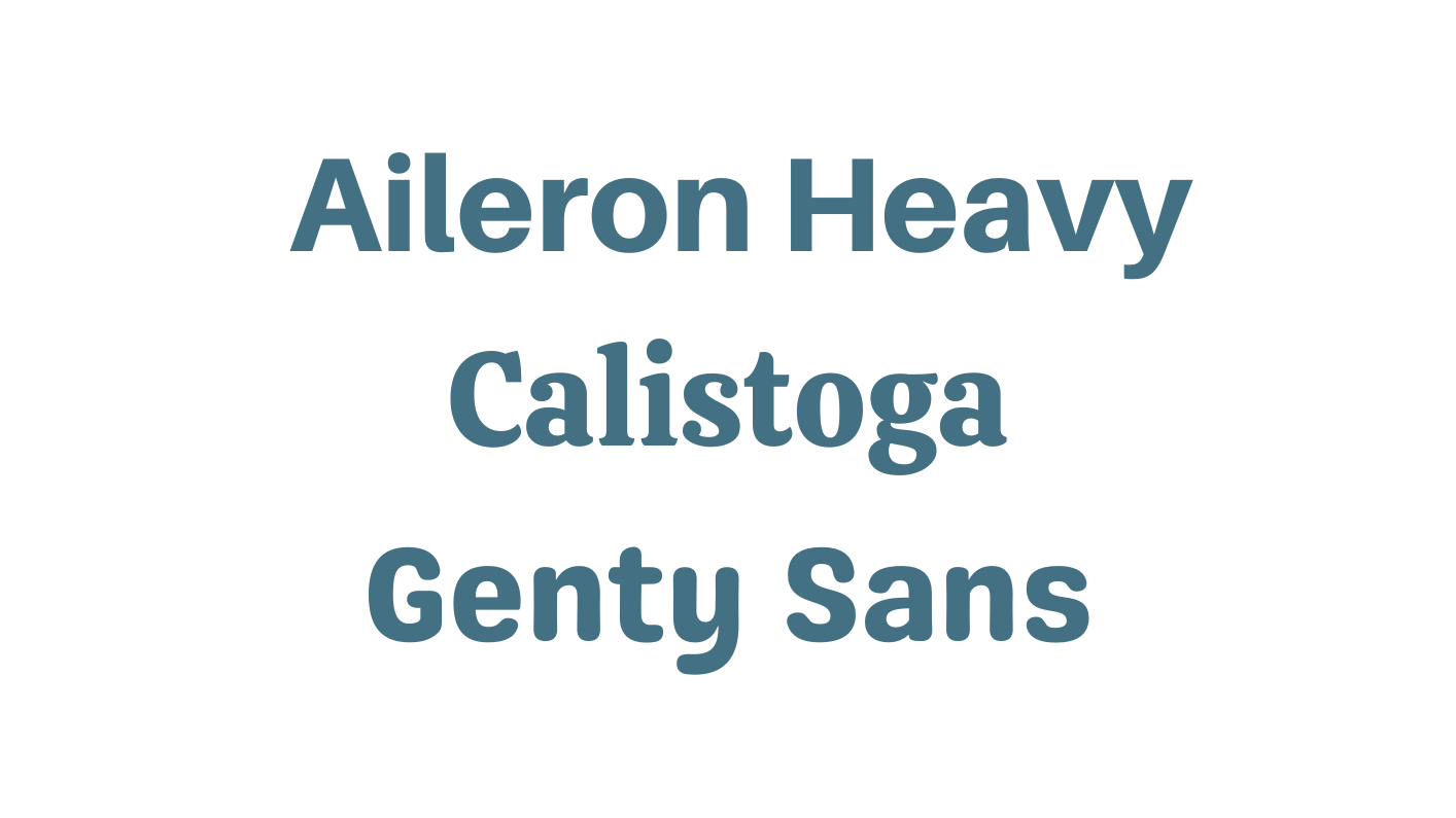
Chunky Style Display Fonts
Great for medium to large sized letters and designs with a small amount of words:
Serif Fonts
Great for medium to large sized letters and designs with a small amount of words:
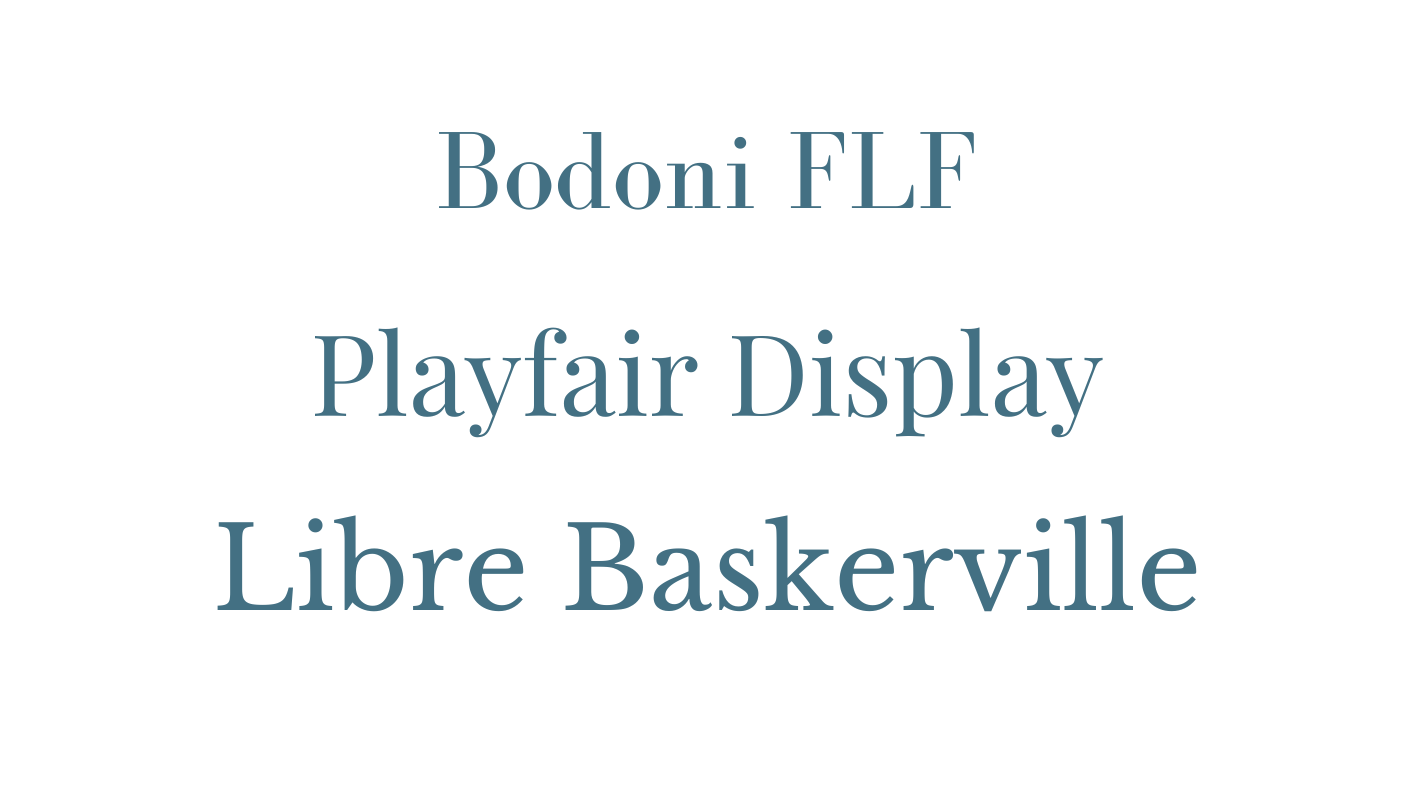
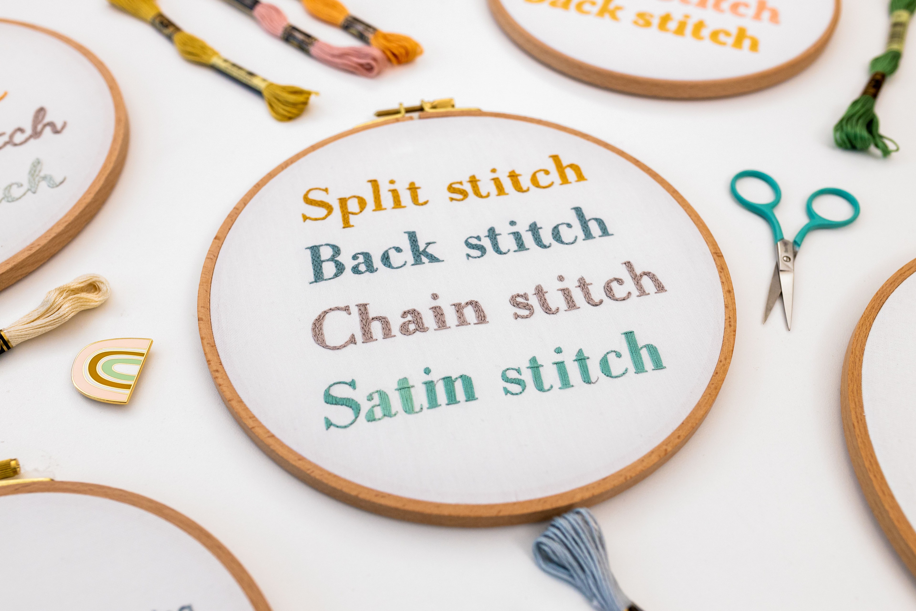
Cursive Fonts – with varied weight letter strokes
Great for medium to large sized letters and designs with a small amount of words:
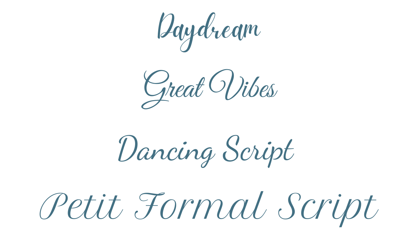
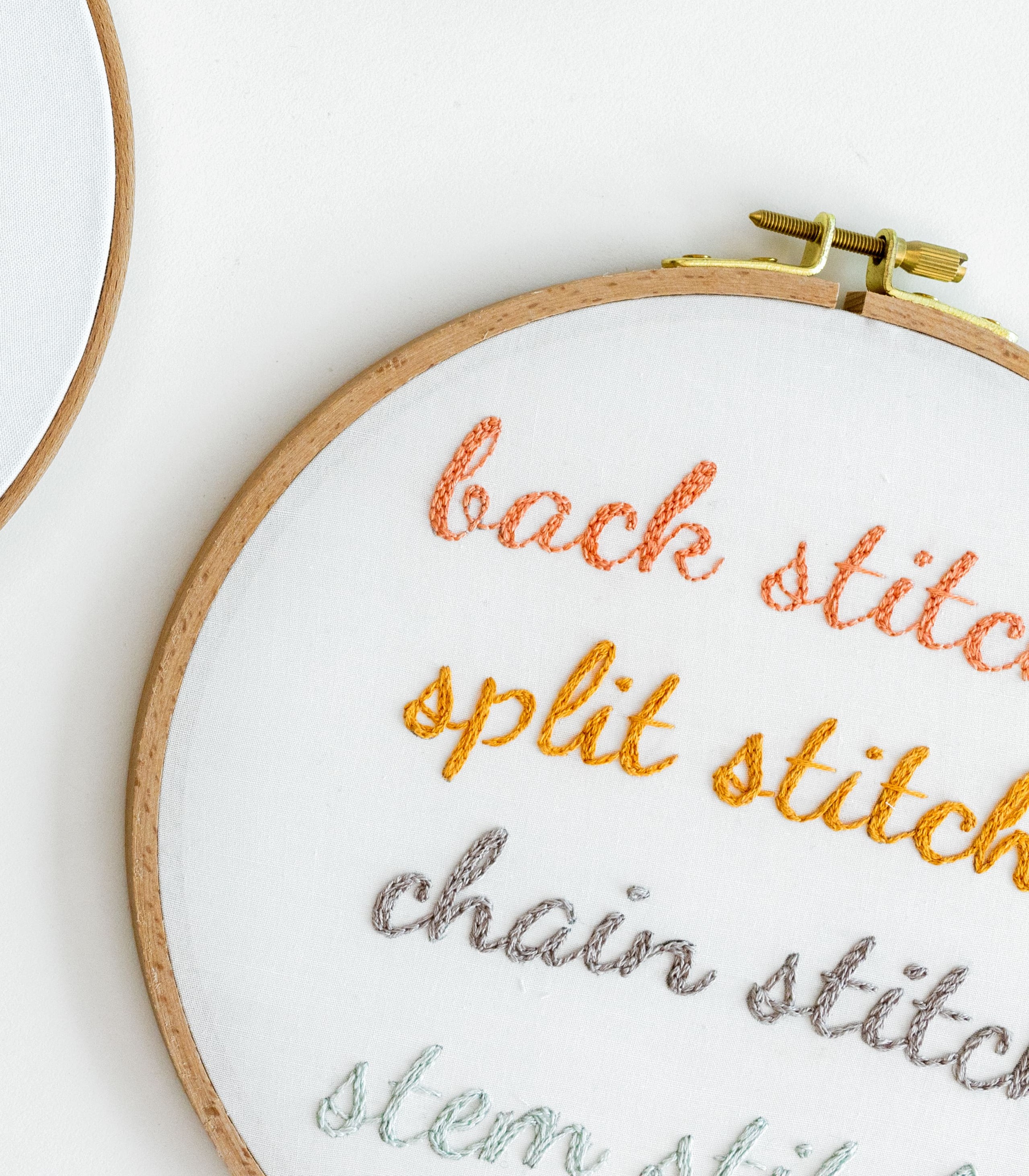
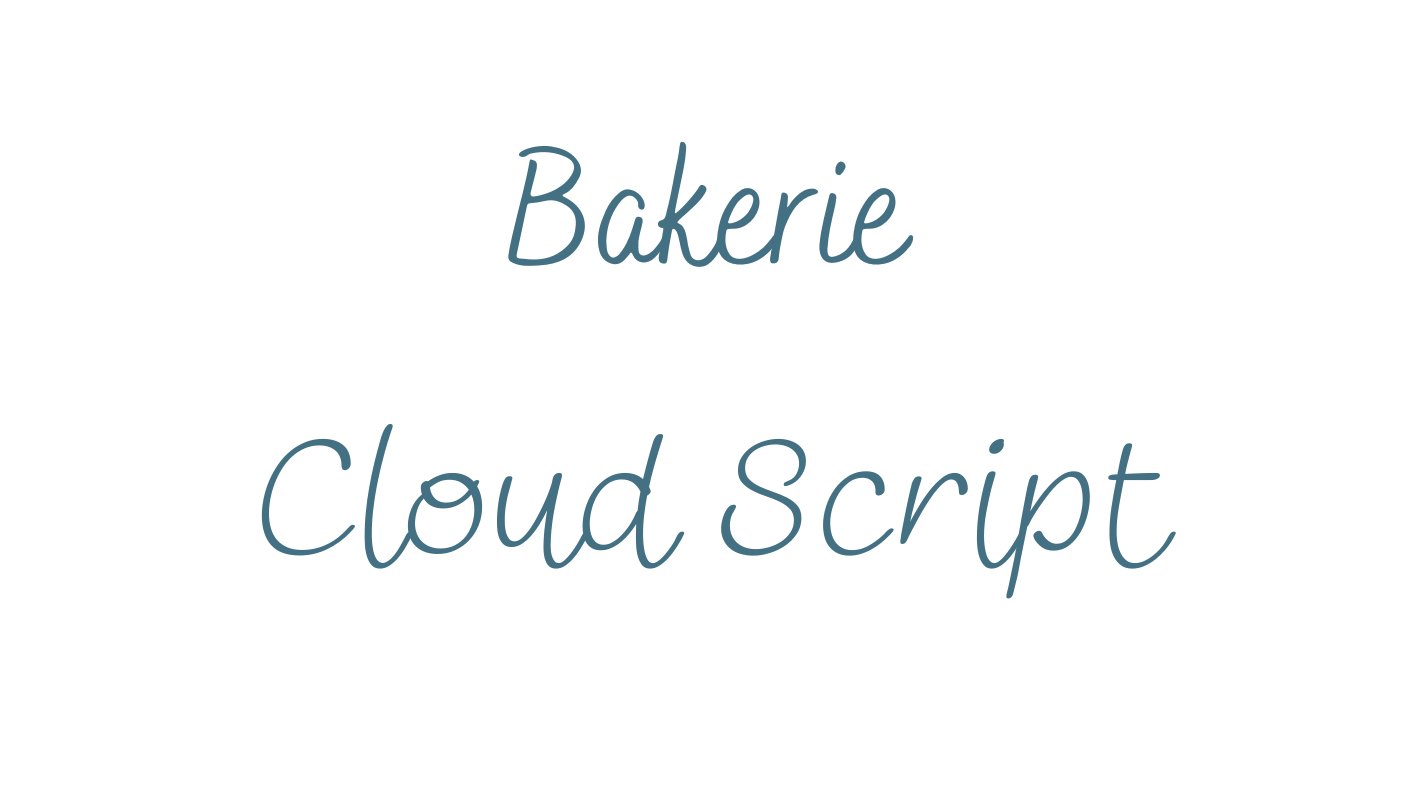
Handwriting Style Script Fonts –with single weight letter strokes
Great for small to medium sized letters and designs with multiple words:
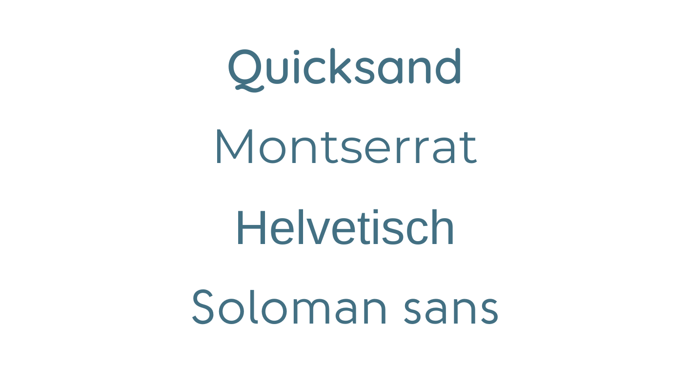
Simple and Readable
Great for small to medium sized letters and designs with lots of words:
In this video, I’ve shared my top tips for lettering, which you will hopefully find really helpful.
Examples of embroidered words
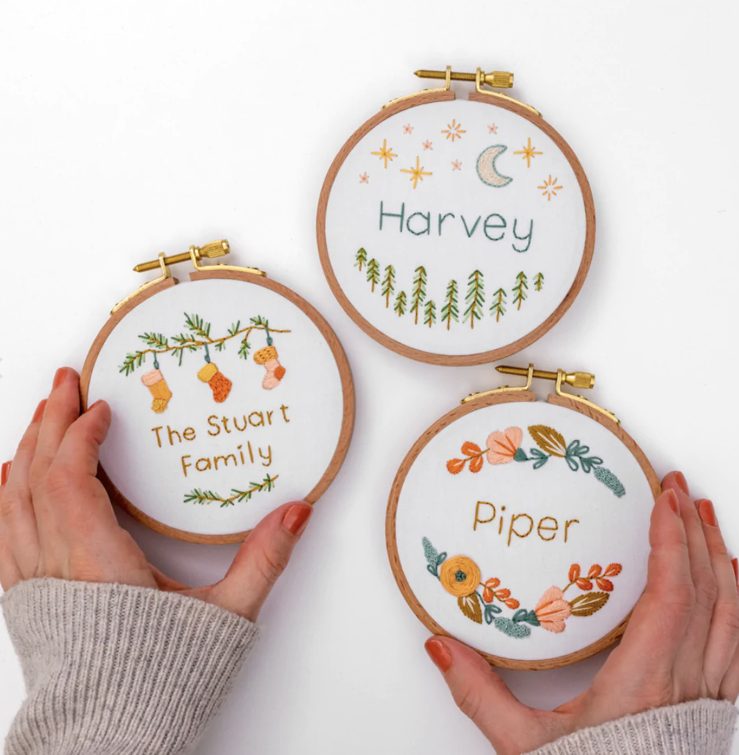
Embroidered words add a lovely personalised touch to your embroidery creations. I've used embroidered words to add that special touch to these Personalised Baubles.
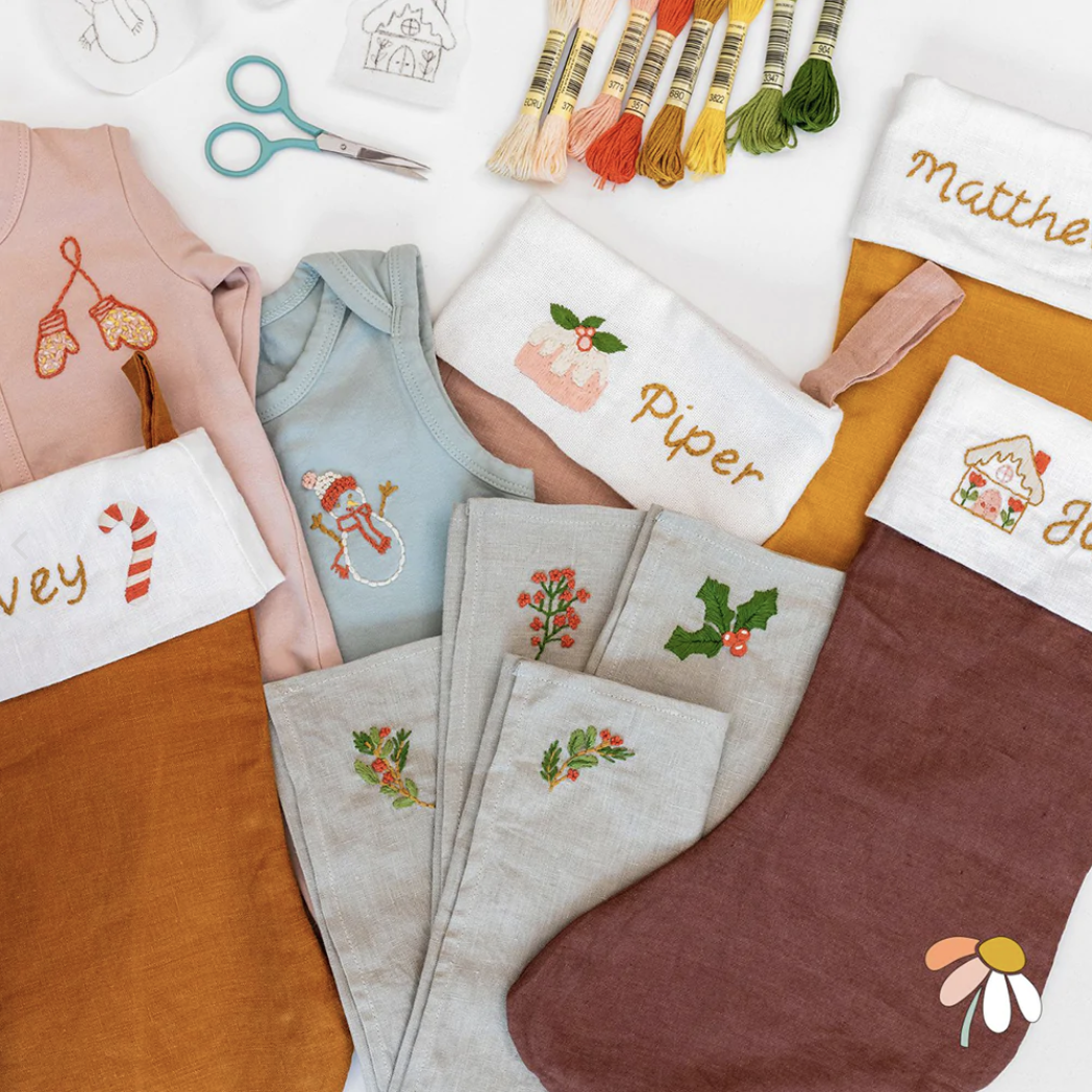
I have also used embroidered words to add names to this Festive Motifs Pattern.
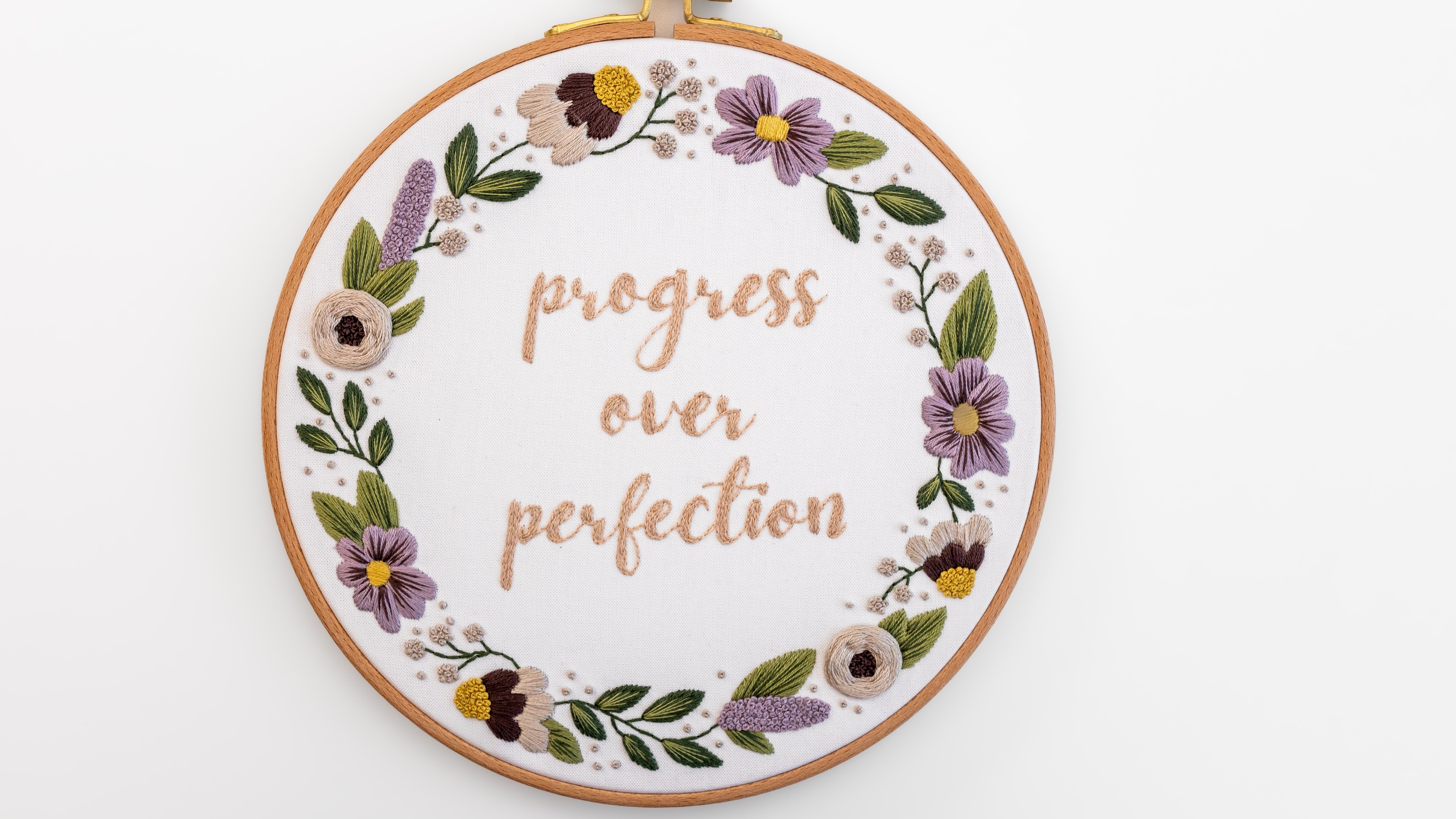
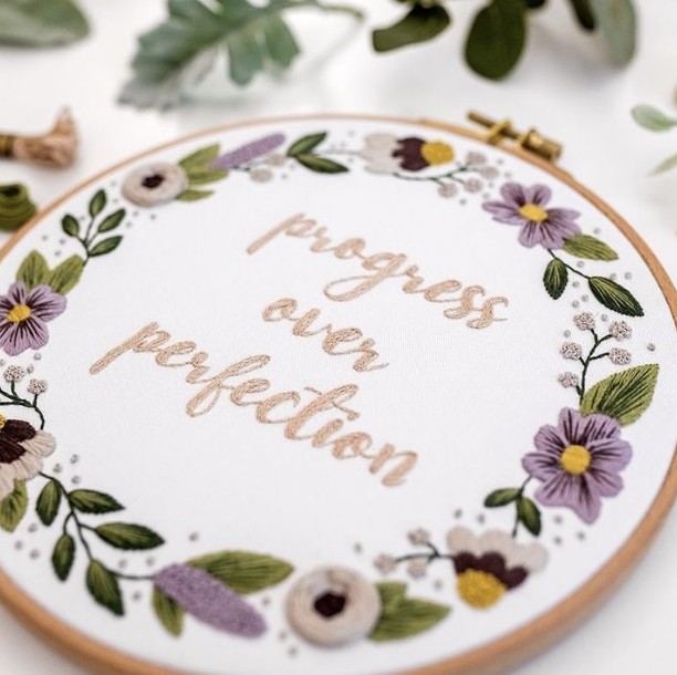
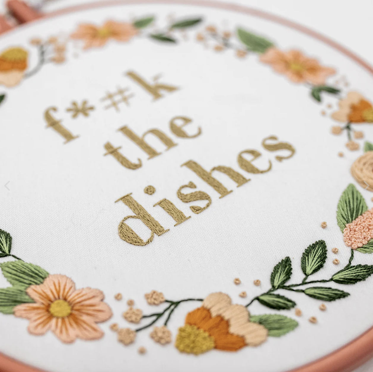
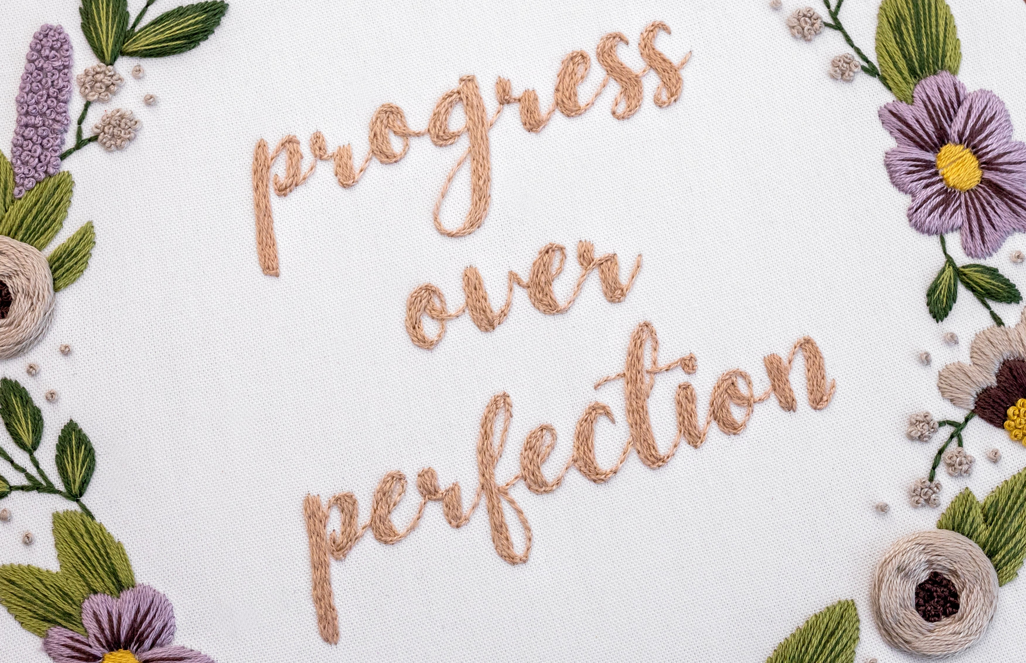
I have also used embroidered words in my patterns F*#k the Dishes, Progress over Perfection, and Get Cosy.
These words add a fun touch to these patterns.
Conclusion
So there we have it, a whole bunch of tips to get you started on your journey with hand-embroidered letters! I just know you'll love personalising your embroidery creations with initials, names, special words and quotes!
I really hope you now feel confident about stitching letters. But most of all, I hope you feel super excited to dive into this area of embroidery.
Because I know how rewarding it is – not only do you get some lovely rewarding me-time... you get to enjoy personalizing your special creations!
We would all love to see what you make, so make sure you share
your progress.

What's next?
And there you have it, how to hand embroider letters! This is such a fun way to personalise your embroidery patterns. I just know you're going to love it.
Make sure you grab the full FREE PDF guide here.
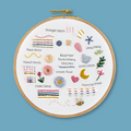
If you’re excited to put your new skills into practice, why not try my Lettering Sampler Beginner Kit? It’s designed for all experience levels and is a great way to explore different lettering styles in embroidery. Grab yours today!
P.S. You should check out my blog, A Beginner's Guide for Embroidery onto Clothing.
Ready to get started? Explore our full Beginner Embroidery Collection and find the perfect kit to kick off your stitching journey!

I would love to hear how you go on your embroidery journey.
Make sure you share you progress with me! Just tag me on the 'gram @cleverpoppy.
Happy stitching!
Julie xx

